Arian Gheie fa il botto a Sotheby’s

Adrian Ghenie

Praticamente è successo che l’altro giorno a Sotheby’s a Londra un quadro del pittore rumeno Adrian Ghenie, classe 1977, è stato battuto per un sacco di soldi: 3,1 milioni di sterline. Parecchio in assoluto e parecchio se si tiene conto che la stima di partenza era di 400-600mila sterline. Non male per l’asta che The Art Newspaper definisce come quella che ha segnato la fine del boom delle aste d’arte contemporanea.

Sul povero Ghenie si è scagliato sua maestà Jerry Saltz che su Facebook ha scritto cose poco lusinghiere su di lui

Not one original idea about color, surface, gesture, subject matter, scale, viscosity, nuttin’ honey. Thickish paint to seem like serious painting. Unfinished bits to let us know it’s modern and self-aware. – Every painting is pretty huge. But it could be great too. Looks a lot like art.
I have been on about how shit this artist is since the beginning; just another artist who makes art that looks like other art that art collectors buy because it looks like what other art collectors buy!)
Which is cool too I guess.

Mi sembra perlomeno ingeneroso. Almeno da quanto abbiamo visto con i nostri occhi al Padiglione Rumeno dell’ultima Biennale di Venezia. Se una cosa si può dire su Ghenie è che sa dipingere davvero bene. Ha una “padronanza del mezzo” davvero notevole. Poi, è vero, si ha l’impressione di vedere lì Bacon, qui Richter, là Polke… È una pittura all’insegna del sincretismo. Ma chi oggi è in grado di sintetizzare la lezione tutti questi grandi messi insieme in modo così credibile?

Lasciamo perdere il prezzo d’asta, chissene frega. Si vede lontano un miglio che il successo di Ghenie è creato a tavolino. Però mi pare resti una sorpresa per la pittura degli ultimi anni. Non l’artista più originale degli ultimi tempi, ma una voce profonda e intonata, dal timbro corposo e virile. Che vale la pena ascoltare.

Stiamo a vedere da che parte andrà in futuro.

Qui qualche immagine scattata a Venezia:

Adrian Ghenie
Adrian Ghenie

Adrian Ghenie
Adrian Ghenie

Adrian Ghenie
Adrian Ghenie

Qui un video sulla mostra alla Pace del 2014:


RICHTER ALLA BEYELER E QUELLE QUATTRO TELE BIANCHE

Studio di Gerhard Richter, Colonia, 19 dicembre 2013, foto di Georges Didi-Huberman.

∑a mostra di Gerhard Richter Pictures/Series alla Beyeler di Basilea è una nuova occasione per ripetersi che, sì, esistono ancora grandi artisti e soprattutto grandi opere d’arte. Guardare, dopo aver visto il pittore tedesco, i Cézanne, i Monet, i Picasso, i Klee della collezione permanente conservata nel Museo progettato da Renzo Piano rinsalda nella certezza che, no, non tutto è perduto come alcuni dicono.

Eppure l’incontro con Richter non è mai facile, perché si tratta di un artista sfuggente, che fugge i tentativi dell’intelligenza di accalappiarlo. Appaga gli occhi, sfianca i neuroni. Non sappiamo bene dove ci porterà, che cosa ci sta dicendo, perché ce lo vuole dire. È qualcosa che ci attrae, di sicuro, e per questo il rovello che ci prende è ancor più intenso.

Qui però vorrei parlare del saggio che Georges Didi-Huberman ha scritto per il catalogo della mostra in forma di lettera allo stesso Richter. Parla di una visita, avvenuta nel dicembre del 2013, allo studio dell’artista. Dice: c’erano quattro tele bianche che attendevano di essere dipinte. Dice: l’arte di Richter vive di dubbio (ostilità verso tutte le forme di ideologia) e di desiderio. Il desiderio come motore del fare arte, che impedisce di arrendersi all’apparente assenza di significato delle cose. Dice: sono mesi che penso a che cosa accadrà di quelle tele bianche. Il critico francese ricorda quella risposta data a Nicholas Serota nell’intervista del catalogo di Panorama, in cui parla dell’impossibilità di raffigurare le immagini dell’olocausto. Ricorda che in quella risposta Richter cita un libro dello stesso Didi-Huberman Immagini malgrado tutto, che tratta proprio la possibilità di creare delle immagini dopo la tragedia dei campi di sterminio. Didi-Huberman racconta che una di queste immagini è appesa dello studio del pittore tedesco e che, andandolo a trovare e vedendo quelle quattro tele bianche ancora da dipingere ha pensato che forse, quello, sarebbe stato il luogo dove, finalmente, dopo sessant’anni di riflessione (c’è una foglio di Atlas dedicato), Richter avrebbe affrontato il tema più difficile. Ecco come termina la lettera:

«Spero che riuscirai a “portar fuori quelle immagini” dal tuo piano di montaggio psichico (troppo travolgente nell’immaginario), dove sono ancora da trovare, e da quel tuo piano di rappresentazione documentaria (troppo travolgente nel reale), dove noi forse le guardiamo. Non per sbarazzarcene, neanche per “salvarle attraverso l’arte”, ma invece, semplicemente per farle uscire e permettere che siano viste in modo diverso. So che quando uno ne ha abbastanza di qualcosa, in Germania voi dite: “Mi vien fuori dalla gola” (Es hängt mir zum Hals raus). In Francia noi diciamo: “Mi viene fuori dagli occhi” (Ça me sort par les yeux). Lasciaci attendere e vedere. Lasciaci vedere se queste immagini, alla fine, “ti verranno fuori attraverso gli occhi”, con l’aiuto della pittura».

Qui qualche foto della mostra di Basilea (che nessuno mi ha impedito di fare)

MOMA E CHRISTIE’S, È L’ANNO DI SIGMAR POLKE

Alice in Wonderland, sigmar polke, Moma 2014
Alice in Wonderland, 1972.

Il 2014 sarà ricordato come l’anno della riscoperta globale di Sigmar Polke. I dati sono chiari: 1) Sabato apre al Moma una grande retrospettiva che ad ottobre alla Tate Modern e  nel 2015 al Museo Ludwig di Colonia. 2) Il 24 inaugura a Londra, alla Christie’s Mayfair una mostra dedicata a lui e al compagno di viaggio degli anni Sessanta: Gerhard Richter. Se grandi istitituzioni (e grandi sponsor, leggi: Wolkswagen) e mercato (Christie’s) si muovono in sincronia, l’operazione è già un successo in partenza.

Di per sé Polke non avrebbe bisogno di riscoperte, ma con l’operazione in corso lo si vuole consegnare alla storia dell’arte come un grande del secondo Novecento come è già è stato fatto con Richter.

Entrambe le occasioni, quella del Moma e da Christie’s, saranno utili per prendere le misure del grande del pittore tedesco, registarne la lettura critica e farlo conoscere al grande pubblico.

Certo, né a New York né a Londra ci saranno capolavori indimenticabili come il monumentale ciclo Axial Age realizzato per la Biennale di Venezia del 2007 ora di proprietà di Pinault e rivisto a Punta della Dogana (Robe da chiodi dice essere una delle meraviglie dello scorso decennio), ma al Moma sembra essere ricostruita in modo abbastanza esauriente (250 opere tra quadri, foto e film) tutta la parabola del pittore.

Pittore, appunto. Come Richter ma in modo molto diverso: più sperimentatore, forse, più istintivo anche se non meno cerebrale (è possibile essere entrambe le cose nello stesso momento?).

A volerlo distruggere basterebbe dire che faceva i pallini come Roy Lichtenstein. Ma è evidente che non è così. Ha dentro molto più mistero (e non faceva solo “i pallini”). Ha una mano fenomenale, un gusto, un senso del colore  che gli fa meritare questo momento di gloria.

Sigmar Polke, Untitled (Quetta, Pakistan) 1974/78


QUANDO RICHTER DISTRUSSE IL SUO RITRATTO DI HITLER

Gerhard Richter, Köln - Courtesy Gerhard- Richter-Archiv Dresden

Nel suo catalogo generale si dice che siano circa 60. Sono le opere che Gerhard Richter ha deciso di distruggere e delle quali si ha un qualche tipo di documentazione. Molte sono degli anni Sessanta, quando da artista semisconosciuto proponeva nelle gallerie tedesche i suoi Foto-Bilder. Come capita ai pittori, non soddisfatto del risultato, prendeva un taglierino e distruggeva la tela. A volte le opere venivano bruciate con altro materiale di scarto. Ma dagli archivi sono emerse una serie di immagini di questi quadri e una in particolare, il ritratto di Hitler (ne parlava qualche mese fa lo Spiegel). Ora, che il nazismo sia uno dei grandi temi dei Foto-Bilder degli anni Sessanta non è un mistero. Richter ritrae lo zio in uniforme della Wehrmacht e fa il ritratto della zia uccisa dal programma nazista di eutanasia per i malati mentali. È forse il primo artista a rompere il tabù che in quegli anni copriva il ricordo dei recenti fatti storici. Mostra come in una normale famiglia tedesca potesse esserci la vittima e il carnefice. Quella di Richter è una poetica anti-ideologica e anti retorica che segna tutta la sua carriera. Si capisce allora come sia possibile che nel 1962 gli sia venuta l’idea di ritrarre proprio lui, Adolf Hitler. Un’immagine che all’epoca deve essere apparsa fortissima, trasgressiva e provocatoria. Nessuno prima di lui aveva osato tanto. Eppure quell’immagine è andata perduta (meglio: l’archivio online usa l’espressione “Gilt als zerstört”, probabilmente distrutta). Perché? Oggi Richter a proposito di quel quadro dice che quel tema e quel ritratto gli apparivano troppo “spettacolari”. Era quindi un quadro non riuscito. Non riuscito perché troppo retorico, troppo massimalista. Troppo retorico, appunto. Sul tema non tornò più anche se anni dopo il volto del Furher si fa spazio nella sua immaginazione, come testimoniano i fogli 131 e 132 del suo Atlas.

Gerhard Richter, Atlas 131, 1969
Gerhard Richter, Atlas 132, 1969

UN VERO FALSO RICHTER PER JERRY SALTZA TRUE FALSE RICHTER FOR JERRY SALTZ

Stanley Casselman, Inhailing Richter, 2012

Bello questo Richter, no? Peccato, però, che sia un falso. Un falso d’autore. L’ha commissionato Jerry Saltz, il critico d’arte del New York Times, all’artista Stanley Casselman. Saltz, scandalizzato dai prezzi astronomici raggiuntii dall’arte contemporanea, e resosi conto che non si sarebbe mai potuto permettere un’opera d’arte come sarebbe piaciuta a lui, ha pensato di commissionare degli autentici falsi da mettersi in casa. L’idea non è nuova, ma l’articolo è molto divertente. Lo trovate qui.

A un certo punto scrive:

Quando Stanley mi ha aperto la porta, ho visto quelli che sembravano 50 grandi quadri di Gerhard Richter. Mi è subito venuta la fantasia di diventare ricco aprendo un negozio di falsi Richter con lui. Poi ho iniziato a guardare più da vicino. Tutti i quadri sembravano richteriani, ma molti avevano un cotè impressionista, una grazia antirichteriana. Molti sembravano troppo pensati. Le casualità sembravano intenzionali piuttosto che scoperte. Potevo individuare le sue decisioni anziché queste mi prendessero di sorpresa. Richter – che applica la pittura a veli, in strati che traspaiono gli uni negli altri – controlla la casualità con un’intelligenza fisica e sottili cambiamenti di direzione e di tocco, le sue decisioni sono in un incredibile rapporto di botta e risposta con le casualità. I suoi dipinti astratti appaiono come fotografie di quadri astratti. Questo crea anomalie nella tua retina-cerebrale di memoria, e ti fa percepire uno spazio misterioso tra astrazione, casualità, fotografia, processo, natura della pittura, e pittura. Questi quadri non ci riuscivano.

Sempre Salz, sulla sua pagina Facebook scriveva:

«Credo che tutta l’arte dovrebbe costare lo stesso importo.
Davvero.
$ 12.000 per qualsiasi cosa fatta dopo il 2000.
$ 15.000 per qualsiasi cosa fatta tra il 1990 e il 2000.
$ 20.000 per qualsiasi cosa fatta tra il 1980 e il 1990.
$ 25.000 per qualsiasi cosa fatta tra il 1975-1980
$ 30.000 per qualsiasi cosa fatta tra il 1970-1975.
$ 40.000 per qualsiasi cosa fatta tra 1965-1970.
$ 50.000 per qualsiasi cosa fatta tra 1.955-1.965.
$ 75.000 per qualsiasi cosa fatta tra 1945-1955.»

E ancora:

«Esperimento mentale per un’asta

1. Immagina aste in cui i prezzi NON SONO NOTI.

2. Immagina aste in cui gli ACQUIRENTI non sono noti.

3. Immagina aste in cui i VENDITORI non sono noti».

Che ne dite? Ci si divertirebbe allo stesso modo?

Stanley Casselman, Inhailing Richter, 2012

A beautiful Richter, isn’t it? It is a pity that it is a fake. A perfect fake. Jerry Saltz, the art critic of The New York Times, commissioned it to artist Stanley Casselman. Saltz, shocked by the astronomical prices achieved by contemporary art, and realizing that he would never have allowed such a work as he would have liked, decided to commission authentic from false to get in the house. The idea is not new, but the article is very entertaining. You can find it here.

At one point he writes:

When Stanley opened his door, I saw what looked like 50 large Gerhard Richters. I immediately had fantasies of getting rich, of opening a Fake Richter shop with him. Then I started looking more closely. All of the paintings seemed Richterian, but many had an Impressionistic, un-Richterian prettiness. Many looked too thought-out. Accidents looked intentional rather than discovered. His decisions stood out instead of taking me by surprise. Richter—who applies paint in scrims, in layers that emerge through one another—controls accident with a physical intelligence and subtle changes of direction and touch; his decisions are in an incredible call-and-response relationship to accidents. His abstract paintings look like photographs of abstract paintings. This creates glitches in your ­retinal-cerebral memory, so that you perceive this uncanny space between abstraction, accident, photography, process, the nature of paint, and painting. These didn’t.

Always Salz, wrote on his Facebook page:

«I think that all art should cost the same amount.
Really.
$12,000 for anything made after 2000.
$15,000 for anything made between 1990 and 2000.
$20,000 for anything made between 1980 and 1990.
$25,000 for anything made between 1975-1980
$30,000 for anything made between 1970 – 1975.
$40,000 for anything made between 1965-1970.
$50,000 for anything made between 1955 – 1965.
$75,000 for anything made between 1945-1955.»

And again:

«An Auction Thought-Experiment

1. Imagine auctions where the prices are NOT KNOWN.
2. Imagine auctions where the BUYERS are not known.
3. Imagine auctions where the SELLARS are not know».

What do you think? We would enjoy it the same way?

GERHARD RICHTER A BEIRUT HA PORTATO LA TATE MODERNGERHARD RICHTER BROUGHT THE TATE MODERN IN BEIRUT

Il quadro di proprietà di Eric Clapton battuto da Sotheby’s a Londra per qualche fantastiliardo di sterline è stato dipinto da Gerhard Richter nel 1994. Molto tempo fa. Oggi Richter ha 80 anni, ma non smette di produrre opere nuove. Negli scorsi mesi ha esposto un lavoro molto particolare nelle sedi di Parigi e New York della Marian Goodman Gallery e in altre mostre in Europa. Con un processo digitale (spiegato qui) è partito da questo suo quadro astratto del 1990:

Gerhard Richter, Abstraktes Bild, Abstract Painting, 1990

e ha ottenuto immagini come questa:

Gerhard Richter

o come questa:

Gerhard Richter

Sono stampe digitali di grande formato (quella subito qui sopra è un 300×300 cm). Molto belle. Certamente non belle come l’originale. Però non è roba che ti aspetteresti da un vecchietto classe 1932. Ma non è qui che volevo arrivare. Richter questa primavera ha fatto una mostra anche al Beirut Art Center dove ha esposto una serie di fotografie dipinte nate da scatti realizzati alla Tate Modern di Londra, immagino l’anno scorso durante la prima tappa di Panorama. Beh, sono meravigliose. Eccone alcune:

Gerhard Richter, Oil on colour photograph, 2011

Gerhard Richter, Oil on colour photograph, 2011

Gerhard Richter, Oil on colour photograph, 2011

Gerhard Richter, Oil on colour photograph, 2011

Tutte le immagini sono prese da www.gerhard-richter.comThe painting owned by Eric Clapton sold by Sotheby’s in London for a few zillion pounds was painted by Gerhard Richter in 1994. A long time ago. Today Richter has 80 years, but he continues to produce new works. In recent months, he has shown a very special work at Marian Goodman Gallery in Paris and New York and in other exhibitions in Europe. With a digital process (explained here) he started with this abstract painting of 1990:

Gerhard Richter, Abstraktes Bild, Abstract Painting, 1990

and he obtained images like this:

Gerhard Richter

or like this:

Gerhard Richter

It is large format digital prints (the one above is a 300×300 cm). Very beautiful. Certainly not as beautiful as the original. But it is not stuff you’d expect from an old man born in 1932. But that’s not where I wanted to go. Richter this spring has also had a show at the Beirut Art Center where he exhibited a series of overpainted photographs born from shots taken at the Tate Modern in London, I guess last year during the first stage of Panorama. Well, they are wonderful. Here are some:

Gerhard Richter, Oil on colour photograph, 2011

Gerhard Richter, Oil on colour photograph, 2011

Gerhard Richter, Oil on colour photograph, 2011

Gerhard Richter, Oil on colour photograph, 2011

All pictures are taken from www.gerhard-richter.com

JENNY SAVILLE, MAMMA E PITTRICE AL MODERN ART OXFORDJENNIY SAVILLE, MOTHER AND PAINTER AT MODERN ART OXFORD

Tra alcuni giorni aprirà una retrospettiva di Jenny Saville al Modern Art Oxford. È la prima volta che un’istituzione pubblica inglese dedica una mostra alla pittrice resa famosa da Charles Saatchi prima e da Larry Gagosian poi. Rachel Cooke sul Guardian le dedica un lungo articolo che vi consiglio di leggere. Mi hanno colpito tre passaggi in particolare:

«Non sono contro l’arte concettuale. Non penso che la pittura debba essere rivalutata. L’arte rispecchia la vita, e le nostre vite sono piene di algoritmi, così molte persone vogliono fare arte come se fosse un algoritmo. Ma il mio linguaggio è la pittura, e la pittura è l’opposto. C’è qualcosa di primitivo in essa. Il bisogno di fare segni è innato. È per questo che quando si è bambini si scarabocchia».

Abbiamo parlato annche del lavoro di altri. Le piacciono sia Gerhard Richter alla Tate Modern che Lucian Freud alla National Portrait Gallery. «È triste che Freud non dipingerà mai più. Ma sto cercando di capire se sia un grande artista o un grande ritrattista. In fondo, perché non dovrebbe essere un grande artista? Ma quando guardo Richter, me lo domando. Richter è senza dubbio un grande artista nel senso pieno della parola».

Recentemente, ha lavorato sul tema della maternità (ha due bambini picoli). «La gente mi diceva [prima che avessi figli] che non sarei stata in grado di impegnarmi nel lavoro una volta che sarebbero nati». Chi erano? Donne? «No!» ride. «Erano uomini. Comunque si sbagliavano. Ora mi godo il mio lavoro dieci volte di più di prima. È ancora una necessità, qualcosa che devo fare. Ma sono più libera da preoccupazioni».

Tra il 2010 e il 2012 Jenny Saville ha lavorato proprio sul tema della maternità. Si è fatta fotografare incinta con il primo figlio in braccio e poi con entrambi i figli. La citazione esplicita è del cartone di Leonardo della National Gallery. Il risultato è la serie “Reproduction” di cui qui sotto ci sono grandi disegni. A me paiono di una bellezza straordinaria. Mi colpisce come la Saville abbia sentito il bisogno, nel rappresentare il rapporto con i suoi figli, di rendere il senso di movimento. Come se il rapporto tra madre e figlio fosse necessariamente dinamico e  fonte di un’energia centrifuga. Ed è proprio questa energia che diventa il vero soggetto del quadro.

Jenny Saville, Reproduction drawing IV (after the Leonardo cartoon), 2010
Reproduction drawing IV (after the Leonardo cartoon), 2010

Jenny Saville, Reproduction drawing II (after the Leonardo cartoon), 2009-2010
Reproduction drawing II (after the Leonardo cartoon), 2009-2010

Jenny Saville, Reproduction drawing I (after the Leonardo cartoon), 2009-2010
Reproduction drawing I (after the Leonardo cartoon), 2009-2010

Jenny Saville, Reproduction drawing III (after the Leonardo cartoon), 2009-2010
Reproduction drawing III (after the Leonardo cartoon), 2009-2010

In a few days will open a Jenny Saville’s retrospective at Modern Art Oxford. It is the first time that a British public institution devoted an exhibition to the painter made famous by Charles Saatchi and Larry Gagosian. Rachel Cooke in The Guardian devotes a long article that I recommend you read. Here are three passages in particular:

«I’m not anti conceptual art. I don’t think painting must be revived, exactly. Art reflects life, and our lives are full of algorithms, so a lot of people are going to want to make art that’s like an algorithm. But my language is painting, and painting is the opposite of that. There’s something primal about it. It’s innate, the need to make marks. That’s why, when you’re a child, you scribble».

We talk, too, about other people’s work. She loved both Gerhard Richter at Tate Modern and Lucian Freud at the National Portrait Gallery. «It’s sad he [Freud] is not going to make any more paintings», she says. «But I’m trying to work out whether he can be seen as a great artist, or whether he is a great portrait painter. I mean, why shouldn’t he be a great artist? But then you look at Richter, and you wonder. Richter is definitely a great artist in the fullest sense of the word».

More recently, she has been inspired by motherhood (she has two small children). «People told me [before I had children] that I wouldn’t be able to engage with my work in the same way once they were born». Which people? Were they women? «No!» She laughs. «They were guys. Anyway, they were wrong. I enjoy the work 10 times more now. It’s still a necessity to me, something I have to do. But I’m more carefree. Partly, it’s watching them – the total freedom they have, scribbling across paper, the way they paint without any need for form. I thought: I fancy a bit of that myself».

Between 2010 and 2012 Jenny Saville has been working on the theme of motherhood. She has been photographed when she was pregnant with her first child in her arms and then with both children. The explicit mention is of Leonardo’s cartoon at the National Gallery. The result is the series “Reproduction” (below). I think they are extraordinarily beautiful. It strikes me as Saville felt the need, representing the relationship with his children, to evoke a sense of movement. As if the relationship between mother and son were necessarily dynamic and source of centrifugal energy. It is this energy that becomes the true subject of the picture.

Jenny Saville, Reproduction drawing IV (after the Leonardo cartoon), 2010
Reproduction drawing IV (after the Leonardo cartoon), 2010

Jenny Saville, Reproduction drawing II (after the Leonardo cartoon), 2009-2010
Reproduction drawing II (after the Leonardo cartoon), 2009-2010

Jenny Saville, Reproduction drawing I (after the Leonardo cartoon), 2009-2010
Reproduction drawing I (after the Leonardo cartoon), 2009-2010

Jenny Saville, Reproduction drawing III (after the Leonardo cartoon), 2009-2010
Reproduction drawing III (after the Leonardo cartoon), 2009-2010

RICHTER, TRE RITRATTI PER LA PICCOLA BETTYRICHTER, THREE PORTRAITS FOR BETTY

Gerhard Richter ha realizzato tre quadri che raffigurano la sua prima figlia Babette, detta Betty. I primi due sono del 1977, mentre l’ultimo del 1988. Il più famoso e il più amato è certamente il terzo (qui Robe da Chiodi ne propone un’interpretazione tanto audace e affascinante quanto legittima). Qui sotto li ripropongo in serie con i rispettivi fogli di Atlas che riportano le fotografie dai quali sono stati tratti. Il primo e il terzo sono esposti, ma in sale diverse, nella mostra “Panorama”, ora a Londra, poi a Berlino e Parigi (ne ho già scritto qui). Vederli così vicini fa un certo effetto. Non so spiegare quale, a dire il vero.  Posso dire però due cose. La prima è che si vede in tutti e tre lo sguardo di un padre. Ciascuno esprime un sentimento diverso con il quale, immagino, un padre sia confrontato. La seconda è che Richter usa (sono tentato di dire “inventa”) tre differenti modi nuovi di realizzare un ritratto. Io dico che il più difficile da sostenere è il primo, non solo perché siamo confrontati con lo sguardo diretto di Betty. Sul terzo, quello famoso, riporto un brano del bel saggio di Achim Borchardt-Hume nel catalogo della mostra (p. 164):

In marked contrast, Betty, is resolutely looking back, albeit with the strong implication that she will soon be looking forward. The painting exudes a deep sense of nostalgia. Richeter’s adolescent daughter turns away from her father’s attempt to freeze her appearance with his camera. By extension, she also turns away from the present-day viewer. The typical Richter blur softens the painting’s photorealism and heightens the motif’s romantic aura (not unlike a photograph taken with a soft-focus lens). At the same time, it mimics the temporality oh photography, which, as Roland Barthes so aptly demonstrated, always entails a sense of loss, if not death, of something irretrievably gone.

Betty, 1977, 30 cm x 40 cm, Oil on canvas
Betty 1977 50 cm x 40 cm Oil on canvas
Betty, 1977, 50 cm x 40 cm, Oil on canvas
Betty Richter, 1978, 36.7 cm x 51.7 cm, Atlas Sheet: 394
Betty, 1988, 102 cm x 72 cm, Oil on canvas
Various Subjects, 1978, 51.7 cm x 66.7 cm, Atlas Sheet: 445

Tutte le immagini sono tratte da www.gerhard-richter.com

Gerhard Richter has created three paintings depicting her first daughter, Babette, said Betty. The first two are from 1977, while the last of 1988. The most famous and most popular is certainly the third (here Robe da Chiodi proposes an audacious and fascinating interpretation of it). Here I show theme together with the respective sheets of Atlas from which the photographs were taken. The first and the third are on display, but in different rooms, in the show “Panorama”, now in London, then in Berlin and Paris (I’ve already written about here). Seeing them so close together makes a certain effect. I can not explain that, actually. But I can say two things. The first is that in all three we can see the gaze of a father. Each expresses a different feeling with which, I imagine, a father is compared. The second is that Richter uses (I’m tempted to say “invented”) three different new ways to paint a portrait. I say the more difficult to sustain is the first, not only because we are faced with the direct gaze of Betty. About the third, the famous one, I carry a piece of the  beautiful essay by Achim Borchardt-Hume in the exhibition catalog (p. 164):

In marked contrast, Betty, is resolutely looking back, albeit with the strong implication that she will soon be looking forward. The painting exudes a deep sense of nostalgia. Richeter’s adolescent daughter turns away from her father’s attempt to freeze her appearance with his camera. By extension, she also turns away from the present-day viewer. The typical Richter blur softens the painting’s photorealism and heightens the motif’s romantic aura (not unlike a photograph taken with a soft-focus lens). At the same time, it mimics the temporality oh photography, which, as Roland Barthes so aptly demonstrated, always entails a sense of loss, if not death, of something irretrievably gone.

Betty, 1977, 30 cm x 40 cm, Oil on canvas
Betty 1977 50 cm x 40 cm Oil on canvas
Betty, 1977, 50 cm x 40 cm, Oil on canvas
Betty Richter, 1978, 36.7 cm x 51.7 cm, Atlas Sheet: 394
Betty, 1988, 102 cm x 72 cm, Oil on canvas
Various Subjects, 1978, 51.7 cm x 66.7 cm, Atlas Sheet: 445

All picture are taken from www.gerhard-richter.com

LA VERSIONE DI SAATCHI E LA SECONDA SIGNORA RICHTERTHE SAATCHI’S VERSION AND THE SECOND MRS. RICHTER

Mentre la Tate Modern celebra Gerhard Richter, Charles Saatchi fa la sua mostra dedicata all’arte contemporanea tedesca: “Gesamtkunstwerk, New art from Germany”. Quello tra Saatchi e la Tate è un duello che dura ormai da due decenni e, secondo Jackie Wullschlager del Financial Times, ha visto il primo avere la meglio sulla seconda (Io non ne sono convinto: con la nascita della Tate Modern le cose sono cambiate).

La cosa curiosa è che tra gli artisti scelti dal collezionista c’è anche Isa Genzken, la seconda moglie di Gerhard Richter (si sposarono nel 1982 e divorziarono nel 1995). Isa Genzken non è un’artista qualunque (nel 2007 rappresentò la Germania alla Biennale di Venezia), ma mi sembra evidente che non regga in nessun modo il confronto con l’ex marito. Qui alcune immagini esposte alla Saatchi Gallery.

Isa Genzken, Bouquet, 2004
Bouquet, 2004

Isa Genzken, Mutter Mit Kind, 2004
Mutter Mit Kind, 2004

Isa Genzken, MLR, 1992 lacquer on canvas, 206 x 185 cm
MLR, 1992 lacquer on canvas, 206 x 185 cm

Isa Genzken, MLR, 1992, lacquer on canvas, 126 x 91.5cm
MLR, 1992, lacquer on canvas, 126 x 91.5 cm

While the Tate Modern celebrates Gerhard Richter, Charles Saatchi makes his German contemporary art exhibition: “Gesamtkunstwerk, New Art from Germany”. The relationship between Saatchi and Tate is a battle that has lasted two decades and, according to Jackie Wullschlager in the Financial Times, saw the first win over the second (I am not convinced with the birth of the Tate Modern things have changed).

The curious thing is that among the artists chosen by the collector is also Isa Genzken, Gerhard Richter’s second wife (they married in 1982 and divorced in1995). Isa Genzken is not any artist (in 2007 represented Germany at the Venice Biennale), but it seems clear that in any way she doesn’t stand the comparison with ex-husband. Here are some pictures exhibited at the Saatchi Gallery.

Isa Genzken, Bouquet, 2004
Bouquet, 2004

Isa Genzken, Mutter Mit Kind, 2004
Mutter Mit Kind, 2004

Isa Genzken, MLR, 1992 lacquer on canvas, 206 x 185 cm
MLR, 1992 lacquer on canvas, 206 x 185 cm

Isa Genzken, MLR, 1992, lacquer on canvas, 126 x 91.5cm
MLR, 1992, lacquer on canvas, 126 x 91.5 cm

RICHTER ALLA TATE, PENSIERI SU UNA MOSTRA INDIMENTICABILERICHTER AT THE TATE, THOUGHTS ON AN UNFORGETTABLE SHOW

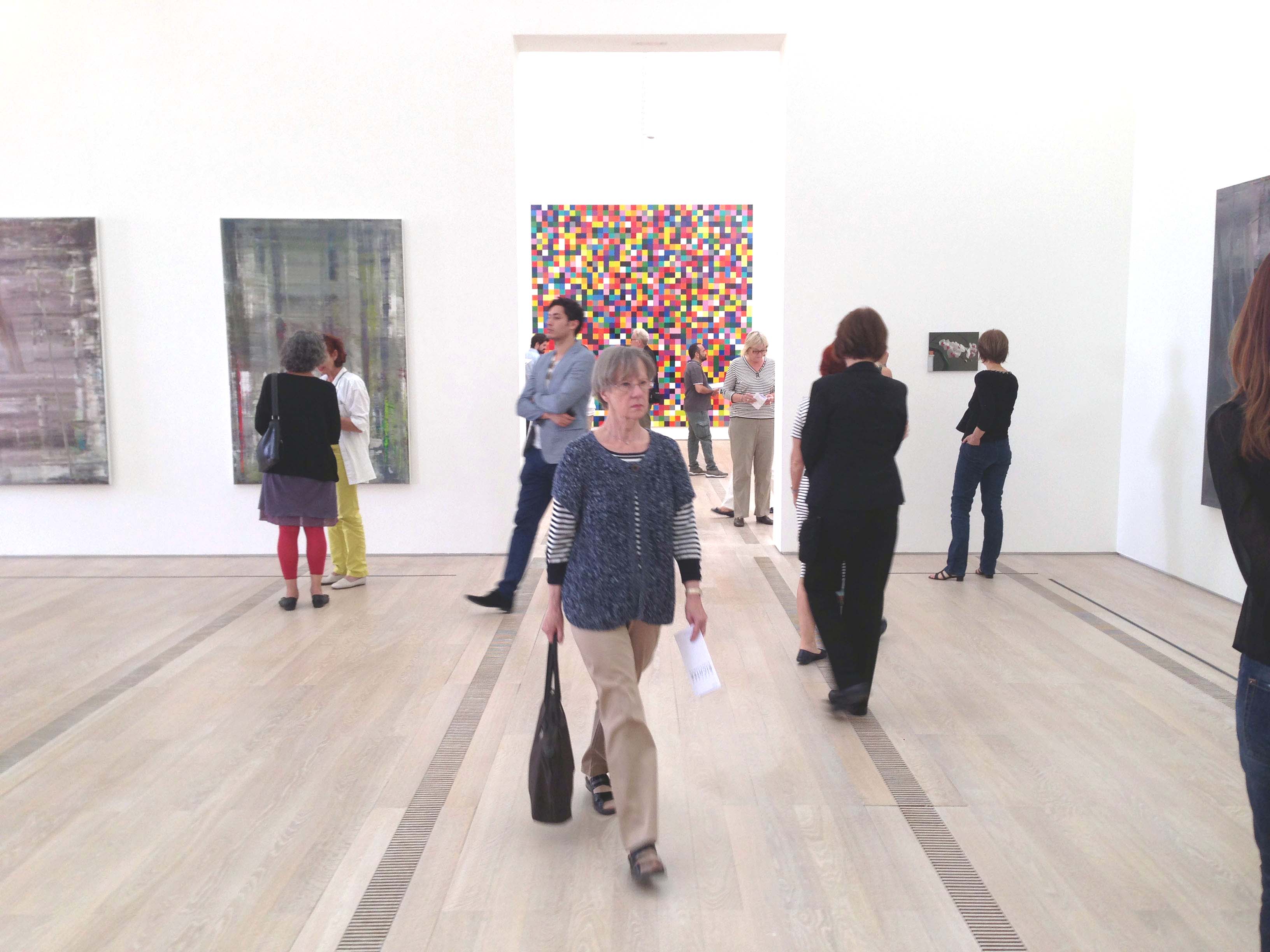
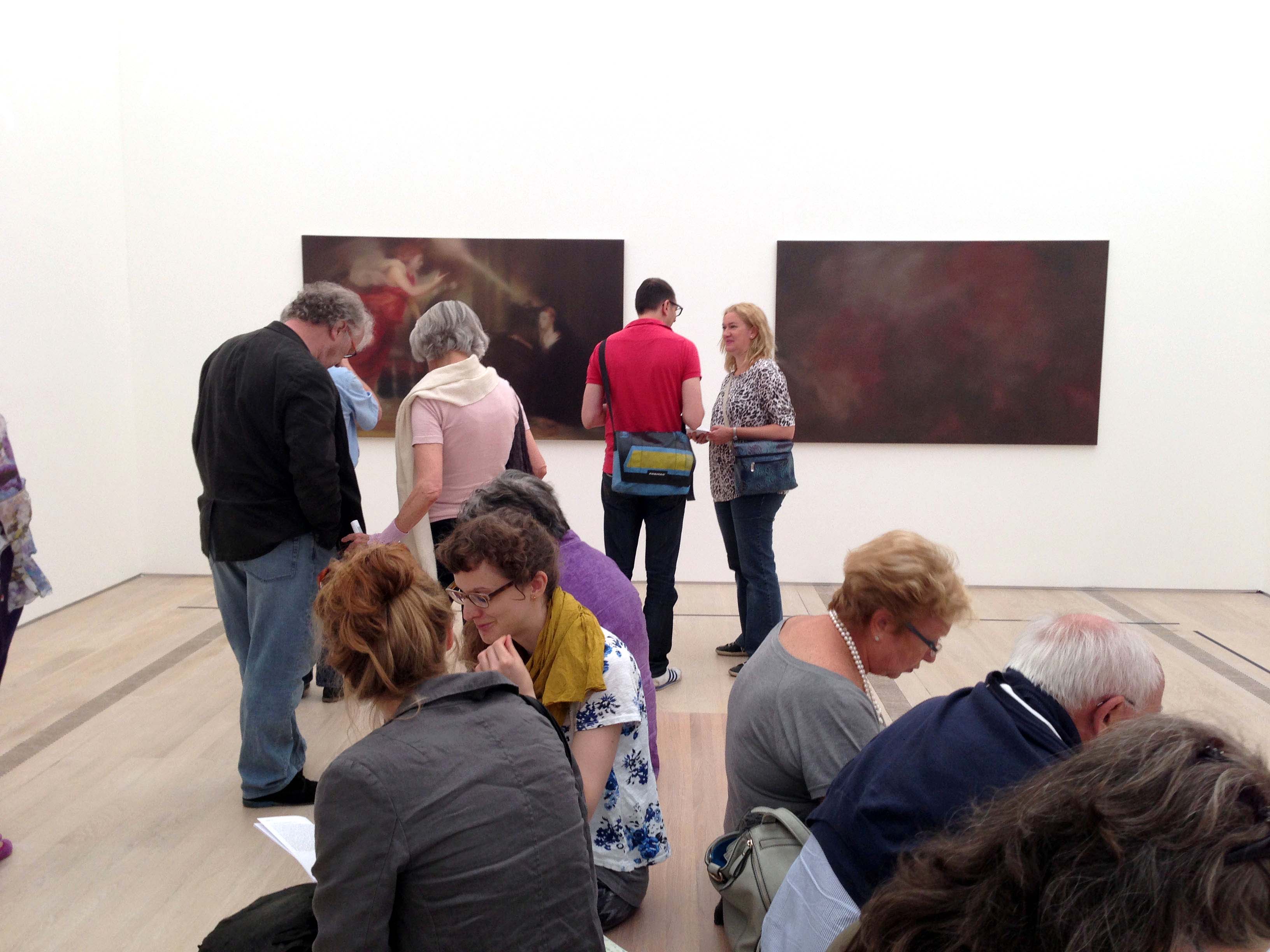
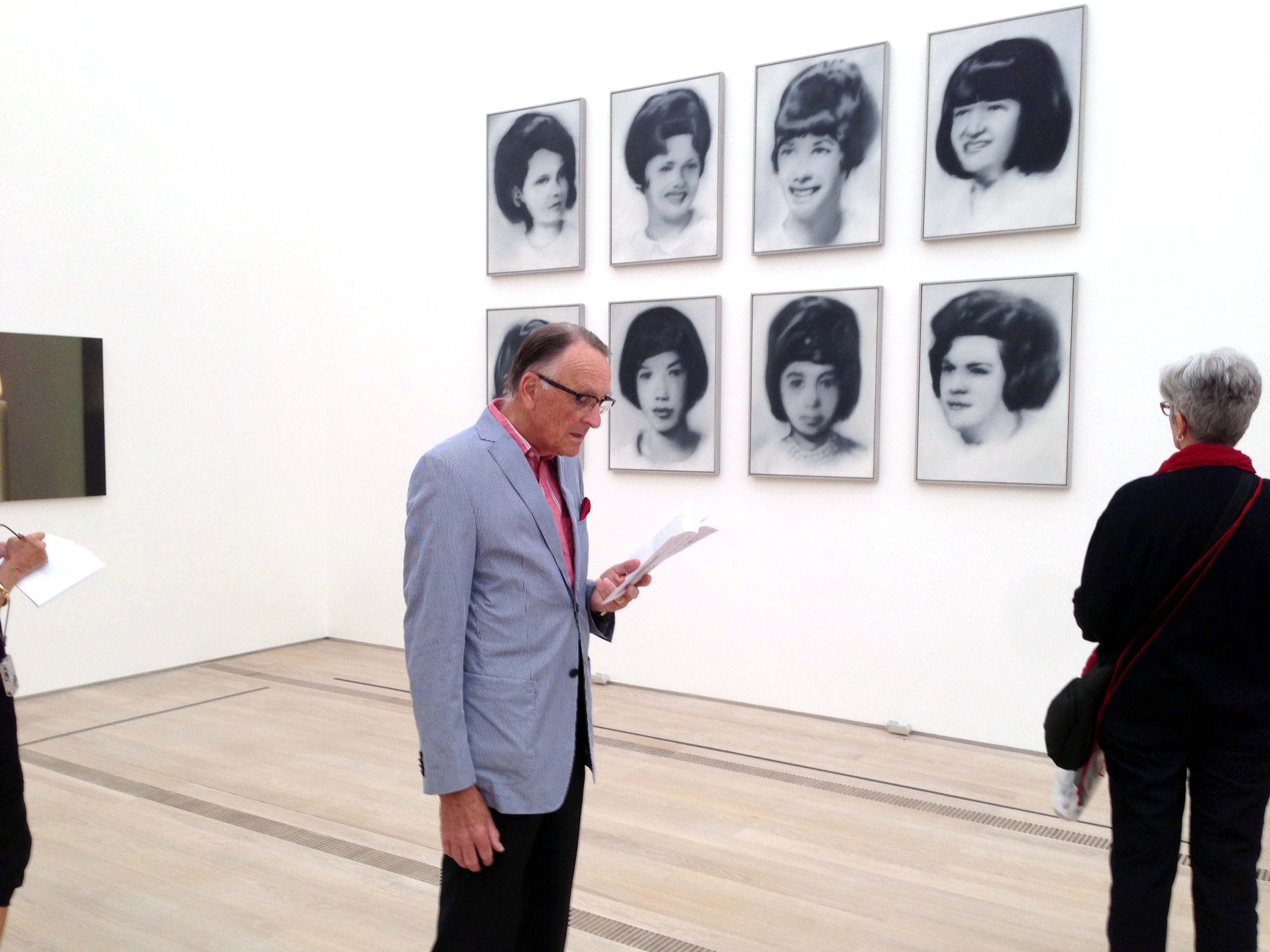
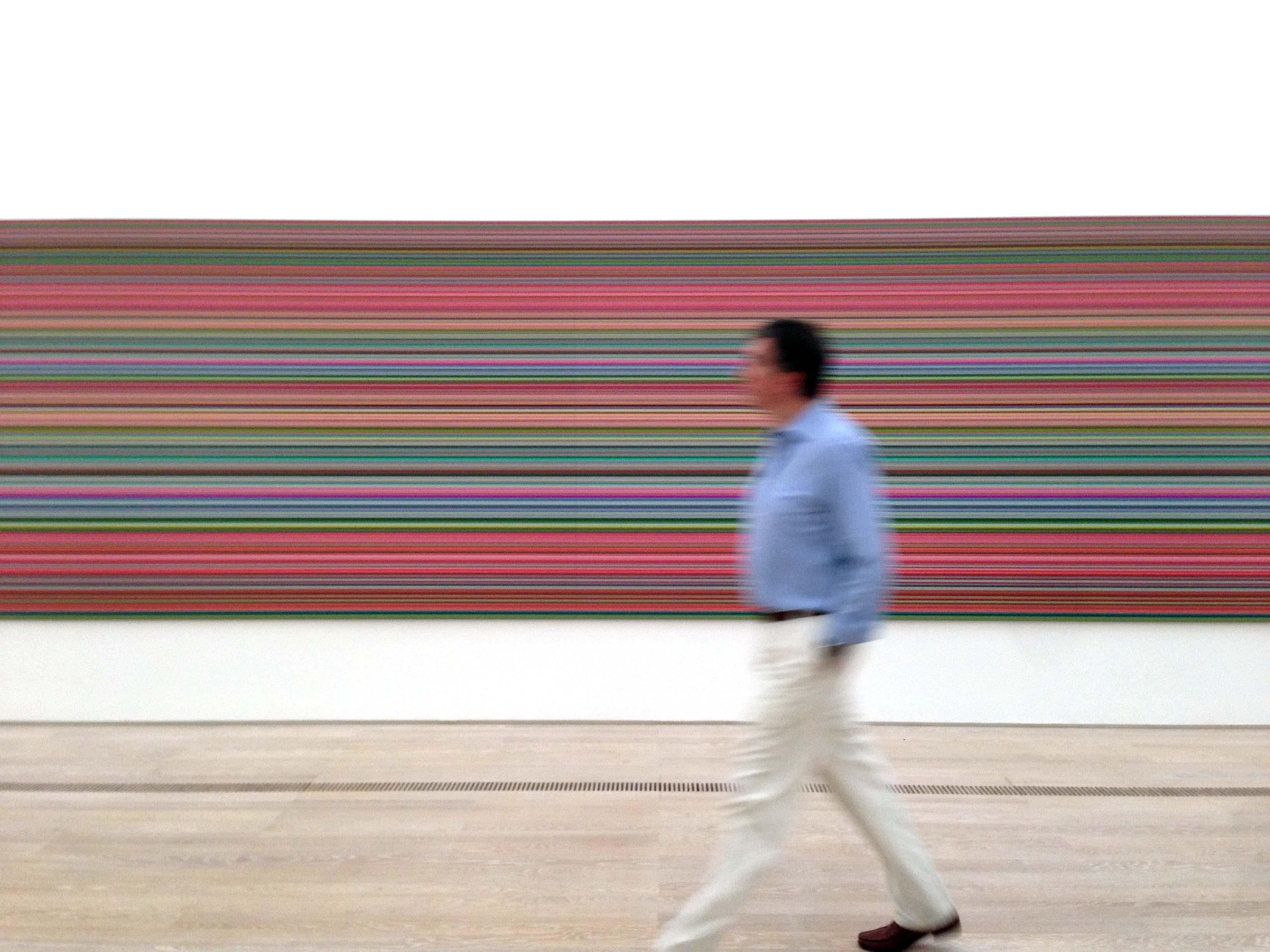
Quella di Gerhard Richter alla Tate Modern è una mostra indimenticabile. Lo sapevo già prima di andarci, visto che si tratta della prima grande antologica sul pittore tedesco, eppure la conferma non è stata priva di sorprese. Indimenticabile perché la grandezza di Richter ha lo spazio per dispiegarsi nonostante i limiti che un allestimento come quello della Tate, inevitabilmente, porta con sé.
La mostra ha un andamento didattico, giustamente cronologico, ma rinuncia o non è stata capace, laddove era possibile, a far deflagrare alcune questioni esplosive insite nell’arte di Richter. Diciamola così: secondo la distinzione che Giovanni Agosti mutua da Pasolini, quella alla Tate è una mostra di prosa e non di poesia.
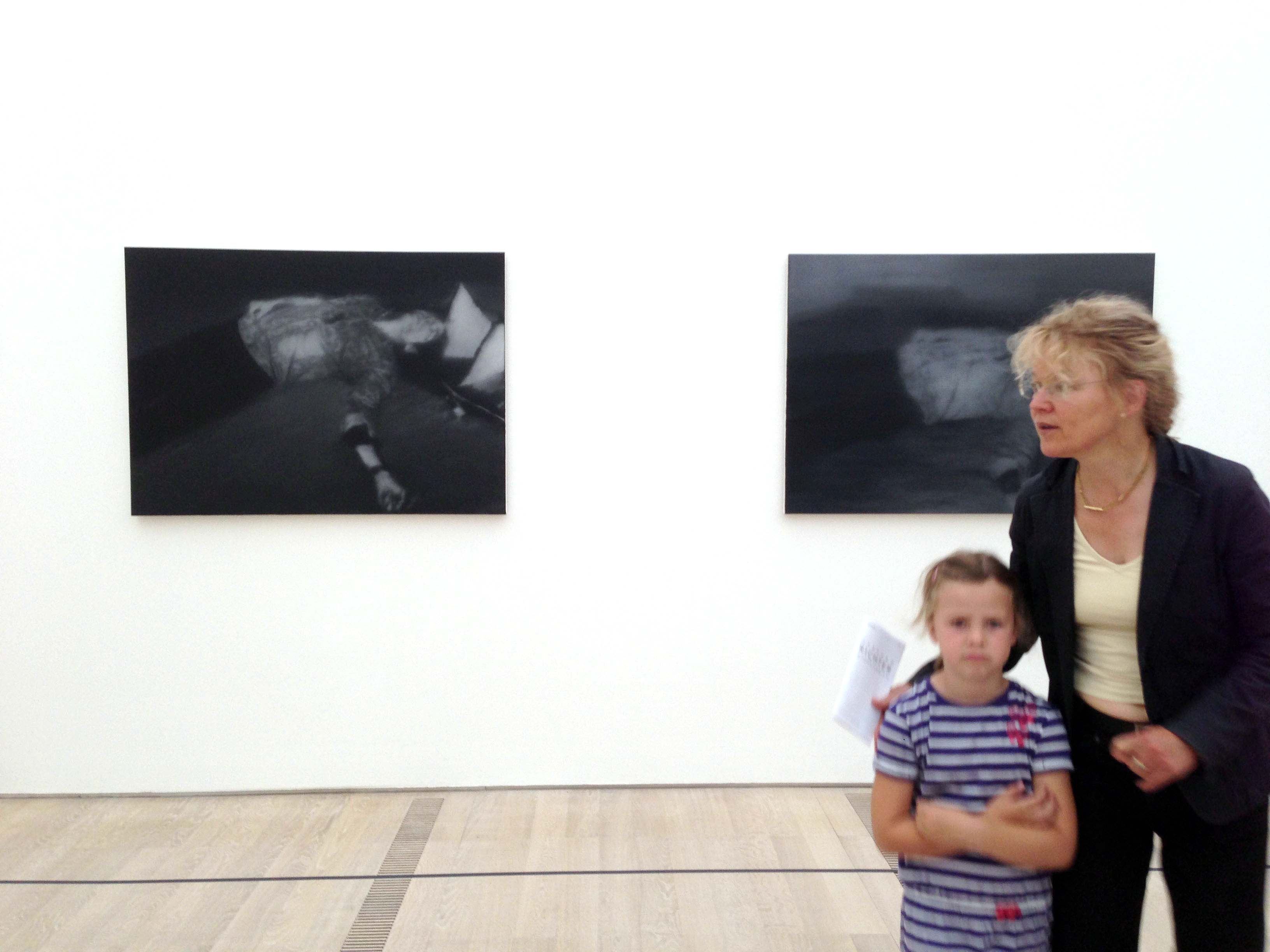
Faccio quattro esempi: il primo è nella seconda sala, quando il rapporto tra “Herr Heyde” (1965) e “Tante Marianne” (1965) non è affatto valorizzato. Il primo quadro, infatti, rappresenta l’arresto del responsabile della politica eugenetica del regime nazista, mentre il secondo è la riproduzione di un immagine in cui Richter bambino è tenuto in braccio dalla zia Marianne, vittima proprio di quella politica. I quadri sono esposti a poca distanza, ma come se tra loro non ci fosse nessuna relazione diretta.

Nella settima sala, invece, sono esposti “Kerze” (1982) e “Schädel” (1983). I curatori, nella loro presentazione della stanza, dicono bene che siamo difronte a una sincera meditazione sulla “vanitas”. Eppure i due quadri non sono accostati e sono posti in punti non strategici (nel catalogo invece le due immagini sono accostate).

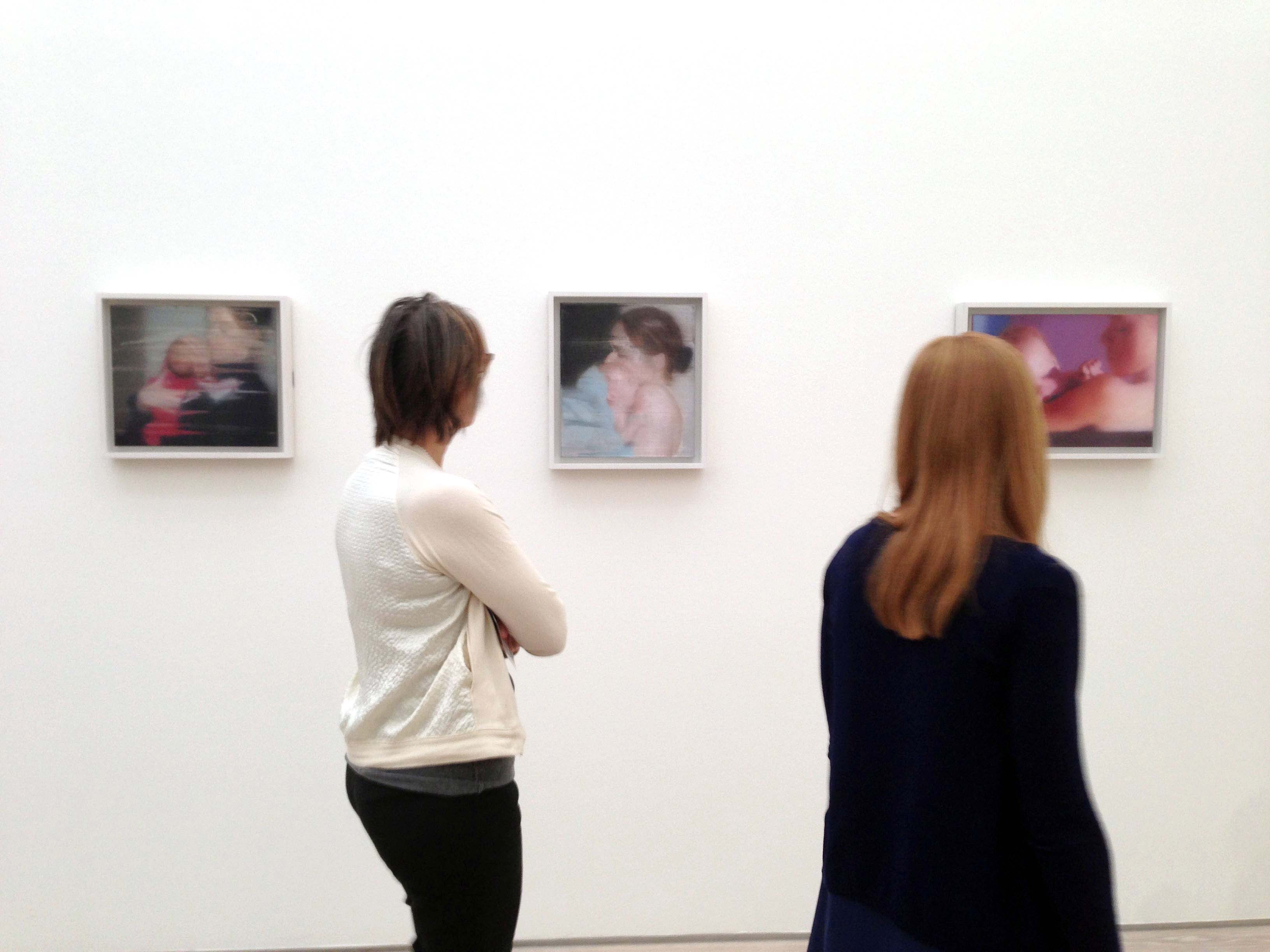
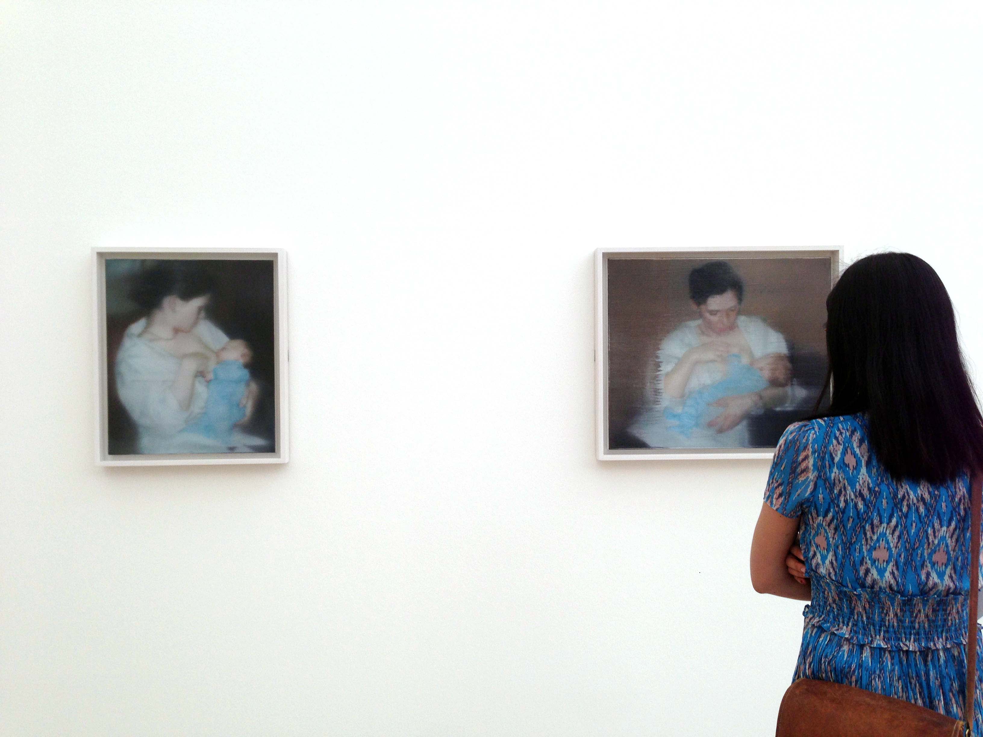
In catalogo sono riportati una serie di quadri del 1995 relativi alla nascita dell’ultimo figlio di Richter: una serie commovente di otto immagini che sono un grandioso inno alla maternità. Bene: in mostra non ci sono. Immagino ci saranno a Berlino o a Parigi. Peccato non averli visti dal vivo.

Ultimo: il quadro “September” (2005) nell’ultima stanza è esposto come uno tra gli altri come se non si trattasse di una delle sfide più azzardate con cui Richter si sia confrontato negli ultimi dieci anni.

Ecco invece le cose che mi sono piaciute.

La prima stanza con il primo quadro “ufficiale” (CR:1) tratto da un’immagine di un tavolo trovata sulla rivista Domus. Un quadro che ha dentro di sé il destino di tutta l’opera di Richter.


Lo straordinario “Neger (Nuba)” (1964) tratto da una foto di Leni Riefenstahl che è il primo photopainting a colori in mostra.


Il fatto che i curatori insistano molto sulla riflessione “in opera” che Richter svolge sulla pittura e il suo rapporto decisivo con l’opera di Duchamp.

Grande il trittico delle tre nuvole “Wolken” (1970).

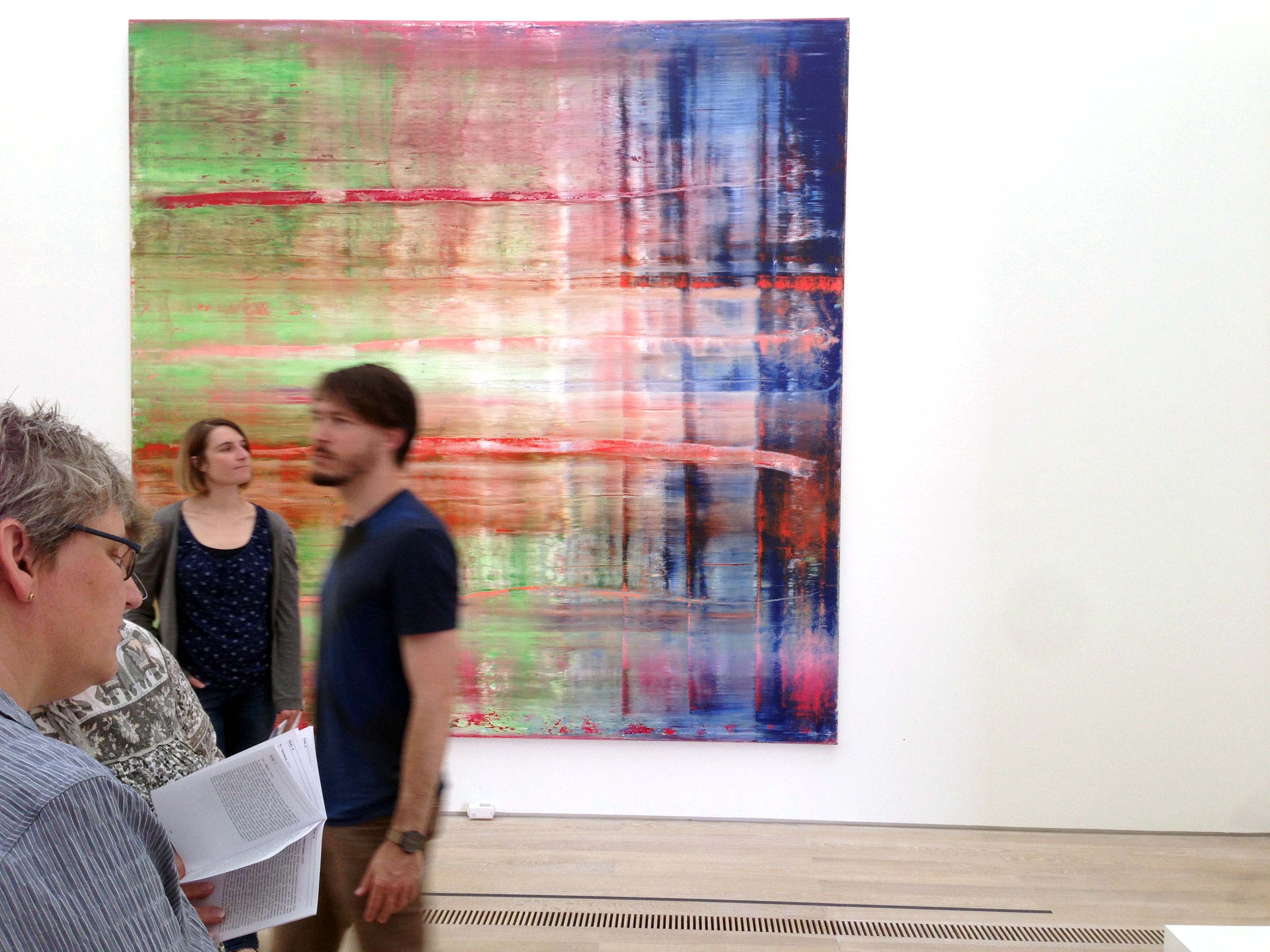
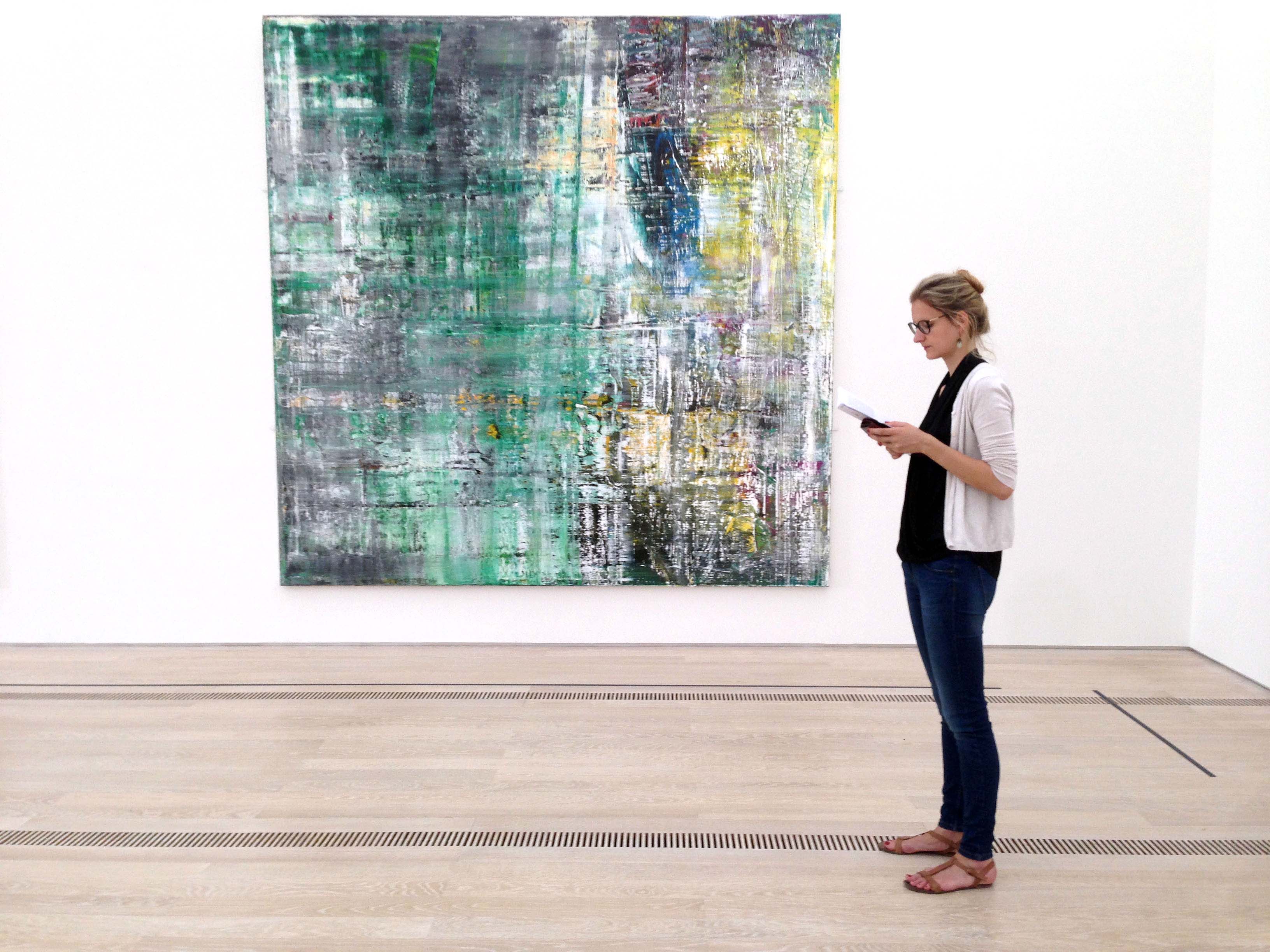
Alcuni quadri astratti scelti sono davvero da capogiro come quello del 1997 (CR:849-2).


E infine: la stanza più clamorosa è quella dedicata al ciclo “Oktober” del 1989. Per intensità, maestria e portata storica.

Un ultima cosa: quel che mi colpisce di più leggendo le interviste di Richter è la sua insistenza a sottolineare il suo orientamento anti-ideologico che, a tratti, appare a sua volta ideologico. La sua volontà di andare contro corrente sempre lo ha portato, paradossalmente, a svolgere il ruolo di paladino della forma d’arte che durante l’ultimo secolo è stata data tante volte per morta: la pittura. Il suo metterne in luce i limiti (come nel corpo a corpo con l’Annunciazione di Tiziano) lo ha portato a scoprirne le frontiere e allo stesso tempo il valore di mezzo di comunicazione contemporanea. Il fatto che ancora oggi, a ottant’anni, Richter continui a dipingere e a inventare cose nuove (vedi la mostra in corso a Parigi) dimostra che questo lavoro di ricerca non è ancora finito.The exhibition by Gerhard Richter at the Tate Modern is an unforgettable. I knew that before, since this is the first major retrospective on the German painter, but confirmation has not been without its surprises. Memorable because the Richter magnitude has the space to unfold despite the limitations that an exhibition such as the Tate inevitably brings.
The exhibition has an educational trend, chronologically correct, but withdraws or has not been able, where possible, to explode at some explosive issues inherent in the art of Richter.
I make four examples:

the first is in the second room, when the relatonship etween “Herr Heyde” (1965) and “Tante Marianne” (1965) is not valued. The first painting, in fact, shows the arrest of chief of eugenics policy during the Nazi regime, while the second is the reproduction of an image in which Richter’s child is held in the arms of Aunt Marianne, a victim of that very policy. The paintings are on display at a short distance, but as if among them there was no direct relationship.

In the seventh room, however, are exposed “Kerze” (1982) and “Schadeli” (1983). The editors, in their presentation of the room, say that we are in front of a sincere meditation on the “vanitas.” Yet the two paintings are juxtaposed and are placed in non-strategic points (in the catalog instead of the two images are touching).

The catalog shows a series of paintings of 1995 relating to the birth of the last son of Richter: moving a series of eight images that are a great hymn to motherhood. Well, they are not on display. I imagine there will be in Berlin or in Paris. Too bad not having seen them live.

Last: the painting “September” (2005) in the last room is exposed as one of the others as if it were not one of the most daring challenges with which Richter has been compared in the last ten years.

Here is the things that I liked:

The first room with the first “official” painting (CR: 1), an image taken from a table found on the magazine Domus. A framework has within himself the destiny of Richter’s whole work.


The extraordinary “Neger (Nuba)” (1964) a photopainting taken from a photo of Leni Riefenstahl which is the first color in the exhibition.


The fact that the editors insist on much reflection “work” that plays on the Richter painting and its relationship with the critical work of Duchamp.

The triptych of the three great clouds “Wolken” (1970).

Some abstract paintings chosen are truly mind-boggling as that of 1997 (CR :849-2).


And finally, the most dramatic room is dedicated to the cycle “Oktober” in 1989. For strength, skill and historical significance.

One last thing: what strikes me most reading the interviews Richter is his insistence to emphasize its anti-ideological orientation that, at times, appears to turn ideological. His willingness to go against the tide always led him, paradoxically, to play the role of champion of the art form during the last century has been given up for dead many times: painting. His highlight the limits (as in combat with the Annunciation by Titian) led him to discover its borders and at the same time the value of contemporary media. The fact that even today, eighty years, Richter continued to paint and invent new things (see the current exhibition in Paris) demonstrates that this research work is not finished yet.