La vincitrice del “Flower Prize 2012″ è Jenny Saville con l’opera Mirror.
Motivazione della Giuria:
Tiziano, Giorgione, Manet e Picasso. E Jenny Saville in persona. Questo quadro è molto affollato. Di riferimenti, soggetti e idee. È una conferenza di Storia dell’arte, ma anche un dichiarazione di poetica. Jenny balla coi mostri sacri della pittura. Si esibisce nella sua danza che ritrova la bellezza, dopo i tempi in cui del corpo era rimasta solo la carne stremata. La Venere di Urbino di Tiziano sdraiata insieme all’Olympia di Manet. Sullo sfondo il paesaggio della Venere dormiente di Giorgione. In mezzo a loro compare il volto della pittrice stessa, che di nuovo si autoritrae sulla destra. Alle sue spalle una misteriosa tela che fa pensare a Picasso (qualcuno pensa a Las Meninas da Velazquez, ma NONAME non è in grado di confermarlo). Un quadro colto, che tuttavia non resta congelato dentro la citazione dotta, ma che vibra di un tratto morbido e deciso. Jenny Saville ha ritrovato la sua strada verso la grande pittura. È dovuta passare dai capolavori del passato ai quali sa guardare senza senso di inferiorità. Non cambia il fulcro della sua ricerca, il corpo, il suo corpo. È la strada ad essere nuova. È una novità per lei. Ma è anche la notizia più interessante di questo stanco 2012.
The winner of the ”Flower Prize 2012″ is Jenny Saville‘s work “Mirror”
Jury motivation:
Titian, Giorgione, Manet and Picasso. And Jenny Saville herself. This painting is pretty crowded. It’s crowded with references, subjects and ideas. It is an art history conference, but also a poetics statement. Jenny is dancing with painting legends. She shows her dance recovering a beauty that was lost, in the exhausted flesh of her early bodies. Titian’s Venus of Urbino lying down next to Manet’s Olympia. In the background, a landscape from Giorgione’s Sleeping Venus. The painter’s face is present among them, self-portrayed on the right. A mysterious painting suggesting Picasso (someone recognized in it Las Meninas after Velazquez, but NONAME can’t verify this) stands behind. This is a cultured painting, but it is not suspended in erudite quotations, it pulsates with determined but smooth strokes. Jenny Saville has found her way to great painting. She had to walk her way through past masterpieces, and she faced them without inferiority complex. The main point (fulcrum) of her research is not changed: it’s still the body, her body. But the way to investigate it, that is brand new. It’s an evolution for her. But this is also the most exciting news for this exhausted 2012.
Cari amici di NONAME eccoci con la quarta edizione del prestigiosissimo Flower Prize. So che molti di voi non stavano nella pelle e hanno perso ore di sonno per sapere chi si contenderà il premio di quest’anno. Eccovi accontentati. Dopo le straordinarie edizioni degli anni scorsi vinte da Marc Quinn, Julia Krahn e Urs Fischer, anche per il 2012 il Flower Prize sarà l’occasione per un accesissimo dibattito.
Ripetiamo le regole: entrano nella short list singole opere realizzate nell’anno in corso e viste di persona dal titolare di NONAME e il vincitore è decretato insidacabilmente dal titolare di NONAME
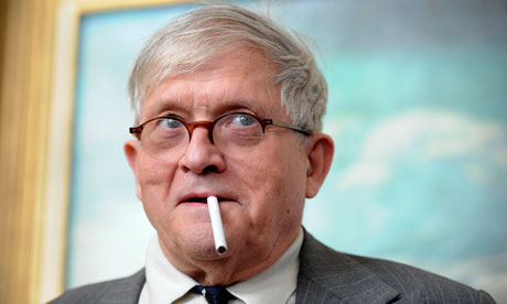
Sono vincoli strettissimi e se ne sono accorti artisti del calibro di David Hockney e Wolfgang Tillmans che, nonostante abbiano realizzato mostre indimenticabili, hanno esposto opere realizzate negli anni scorsi. NONAME ha ricevuto il loro ricorso ma lo ha respinto, perché le regole sono le regole (chiedete a Renzi come funzionano queste cose).
Il vincitore sarà proclamato il 22 dicembre (sempre che il giorno prima non finisca il mondo).
Come vi accorgerete il mood del premio di quest’anno è in linea con le parole chiave di questo 2012 che va a concludersi: rigore e austerità.
Rullo di tamburi.
Ecco la short list del prestigiosissimo Flower Prize 2012:
1) Marlene Dumas con Mamma Roma
2) Wouter Klein Velderman con Ivory and Pride
3) Jenny Saville con Mirror
4) Giovanni Chiaramonte con Cimitero di Nonantola
Dear NONAME’s friends, here we are with the 4h edition of the prestigious Flower Prize. I know that many of you were jumping out of their skins, and have lost tons of sleeping hours waiting to know who the nominees are. Here you are. After the extraordinary editions of recent years won by Marc Quinn, Julia Krahn and Urs Fischer, for 2012 the Flower Prize will be an opportunity for a heated debate.
We repeat the rules: Only works made in the current year and that the owner of this blog has seen live can enter the short list.
Constraints are tight, we know, and it has been noticed by artists such as David Hockney and Wolfgang Tillmanswho, although they have made unforgettable exhibitions, have exposed works created in recent years and not in 2012. NONAME received their appeal but rejected it, because rules are rules.
The winner will be announced Dec. 22 (assuming that the day before the world wouldn’t end up).
As you will notice the mood of this year’s award is in line with the keywords of this going to end 2012: rigor and austerity.
Drum roll.
Here’s the short list of the prestigious Flower Prize 2012:
1) Marlene Dumas with Mamma Roma
2) Wouter Klein Velderman with Ivory and Pride
3) Jenny Saville with Mirror
4) Giovanni Chiaramonte with Cimitero di Nonantola
Bello questo Richter, no? Peccato, però, che sia un falso. Un falso d’autore. L’ha commissionato Jerry Saltz, il critico d’arte del New York Times, all’artista Stanley Casselman. Saltz, scandalizzato dai prezzi astronomici raggiuntii dall’arte contemporanea, e resosi conto che non si sarebbe mai potuto permettere un’opera d’arte come sarebbe piaciuta a lui, ha pensato di commissionare degli autentici falsi da mettersi in casa. L’idea non è nuova, ma l’articolo è molto divertente. Lo trovate qui.
A un certo punto scrive:
Quando Stanley mi ha aperto la porta, ho visto quelli che sembravano 50 grandi quadri di Gerhard Richter. Mi è subito venuta la fantasia di diventare ricco aprendo un negozio di falsi Richter con lui. Poi ho iniziato a guardare più da vicino. Tutti i quadri sembravano richteriani, ma molti avevano un cotè impressionista, una grazia antirichteriana. Molti sembravano troppo pensati. Le casualità sembravano intenzionali piuttosto che scoperte. Potevo individuare le sue decisioni anziché queste mi prendessero di sorpresa. Richter – che applica la pittura a veli, in strati che traspaiono gli uni negli altri – controlla la casualità con un’intelligenza fisica e sottili cambiamenti di direzione e di tocco, le sue decisioni sono in un incredibile rapporto di botta e risposta con le casualità. I suoi dipinti astratti appaiono come fotografie di quadri astratti. Questo crea anomalie nella tua retina-cerebrale di memoria, e ti fa percepire uno spazio misterioso tra astrazione, casualità, fotografia, processo, natura della pittura, e pittura. Questi quadri non ci riuscivano.
Sempre Salz, sulla sua pagina Facebook scriveva:
«Credo che tutta l’arte dovrebbe costare lo stesso importo.
Davvero.
$ 12.000 per qualsiasi cosa fatta dopo il 2000.
$ 15.000 per qualsiasi cosa fatta tra il 1990 e il 2000.
$ 20.000 per qualsiasi cosa fatta tra il 1980 e il 1990.
$ 25.000 per qualsiasi cosa fatta tra il 1975-1980
$ 30.000 per qualsiasi cosa fatta tra il 1970-1975.
$ 40.000 per qualsiasi cosa fatta tra 1965-1970.
$ 50.000 per qualsiasi cosa fatta tra 1.955-1.965.
$ 75.000 per qualsiasi cosa fatta tra 1945-1955.»
E ancora:
«Esperimento mentale per un’asta
1. Immagina aste in cui i prezzi NON SONO NOTI.
2. Immagina aste in cui gli ACQUIRENTI non sono noti.
3. Immagina aste in cui i VENDITORI non sono noti».
Che ne dite? Ci si divertirebbe allo stesso modo?Stanley Casselman, Inhailing Richter, 2012
A beautiful Richter, isn’t it? It is a pity that it is a fake. A perfect fake. Jerry Saltz, the art critic of The New York Times, commissioned it to artist Stanley Casselman. Saltz, shocked by the astronomical prices achieved by contemporary art, and realizing that he would never have allowed such a work as he would have liked, decided to commission authentic from false to get in the house. The idea is not new, but the article is very entertaining. You can find it here.
At one point he writes:
When Stanley opened his door, I saw what looked like 50 large Gerhard Richters. I immediately had fantasies of getting rich, of opening a Fake Richter shop with him. Then I started looking more closely. All of the paintings seemed Richterian, but many had an Impressionistic, un-Richterian prettiness. Many looked too thought-out. Accidents looked intentional rather than discovered. His decisions stood out instead of taking me by surprise. Richter—who applies paint in scrims, in layers that emerge through one another—controls accident with a physical intelligence and subtle changes of direction and touch; his decisions are in an incredible call-and-response relationship to accidents. His abstract paintings look like photographs of abstract paintings. This creates glitches in your retinal-cerebral memory, so that you perceive this uncanny space between abstraction, accident, photography, process, the nature of paint, and painting. These didn’t.
Always Salz, wrote on his Facebook page:
«I think that all art should cost the same amount.
Really.
$12,000 for anything made after 2000.
$15,000 for anything made between 1990 and 2000.
$20,000 for anything made between 1980 and 1990.
$25,000 for anything made between 1975-1980
$30,000 for anything made between 1970 – 1975.
$40,000 for anything made between 1965-1970.
$50,000 for anything made between 1955 – 1965.
$75,000 for anything made between 1945-1955.»
And again:
«An Auction Thought-Experiment
1. Imagine auctions where the prices are NOT KNOWN.
2. Imagine auctions where the BUYERS are not known.
3. Imagine auctions where the SELLARS are not know».
What do you think? We would enjoy it the same way?
Il video folle (e irresistibile) di Ai Weiwei a favore della libertà di espressione è ormai un classico. Paragonata alle austere immagini del Congresso del Partito comunista cinese che si è appena concluso a Pechino, la performance di Ai è poesia pura. Ne ha fatta una versione anche Anish Kapoor, ironica, autoironica, certo, anche se un po’ venata di politically correct, nella quale sono coinvolti un po’ di personaggi e istituzioni inglesi e americane. Di italiani neanche l’ombra. Eppure grandi personaggi ce ne sono nel nostro Paese. Considerando fuori dai giochi Giovanna Melandri (perché ha già dato), ecco una possibile terna per la prossima versione Gangnam Syle.
Il quadro di proprietà di Eric Clapton battuto da Sotheby’s a Londra per qualche fantastiliardo di sterline è stato dipinto da Gerhard Richter nel 1994. Molto tempo fa. Oggi Richter ha 80 anni, ma non smette di produrre opere nuove. Negli scorsi mesi ha esposto un lavoro molto particolare nelle sedi di Parigi e New York della Marian Goodman Gallery e in altre mostre in Europa. Con un processo digitale (spiegato qui) è partito da questo suo quadro astratto del 1990:
e ha ottenuto immagini come questa:
o come questa:
Sono stampe digitali di grande formato (quella subito qui sopra è un 300×300 cm). Molto belle. Certamente non belle come l’originale. Però non è roba che ti aspetteresti da un vecchietto classe 1932. Ma non è qui che volevo arrivare. Richter questa primavera ha fatto una mostra anche al Beirut Art Center dove ha esposto una serie di fotografie dipinte nate da scatti realizzati alla Tate Modern di Londra, immagino l’anno scorso durante la prima tappa di Panorama. Beh, sono meravigliose. Eccone alcune:
Tutte le immagini sono prese da www.gerhard-richter.comThe painting owned by Eric Clapton sold by Sotheby’s in London for a few zillion pounds was painted by Gerhard Richter in 1994. A long time ago. Today Richter has 80 years, but he continues to produce new works. In recent months, he has shown a very special work at Marian Goodman Gallery in Paris and New York and in other exhibitions in Europe. With a digital process (explained here) he started with this abstract painting of 1990:
and he obtained images like this:
or like this:
It is large format digital prints (the one above is a 300×300 cm). Very beautiful. Certainly not as beautiful as the original. But it is not stuff you’d expect from an old man born in 1932. But that’s not where I wanted to go. Richter this spring has also had a show at the Beirut Art Center where he exhibited a series of overpainted photographs born from shots taken at the Tate Modern in London, I guess last year during the first stage of Panorama. Well, they are wonderful. Here are some:
Francis Bacon, In memory of George Dyer, 1971, Beyeler Foundation
Un modo per parlare della mostra su Edgar Degas alla Fondazione Beyeler di Basilea è partire dalla fine. E cioè dalla sala che segue l’ultima stanza della mostra. Qui sono esposte tre opere di Francis Bacon (In memory of George Dyer, 1971; Portrait of George Dyer riding a bicycle, 1966 e Sand dune, 1983), una di Auguste Rodin (Iris, messagère des dieux (figure volante), 1890/91) e una di Lucio Fontana (un Concetto spaziale in terracotta simile a questo). L’effetto “doccia scozzese” che procura questa sala aiuta, con il suo shock, a toglierci di dosso la lettura che saremmo portati a sulle opere dell’ultimo Degas (tema della mostra). Invece guardare Degas con gli occhi di Bacon è un esercizio salutare perché spoglia il pittore francese da una possibile lettura “piccolo borghese”. Non è un mistero che Bacon amasse Degas e lo considerasse uno dei suoi artisti di riferimento. Ne parlò diverse volte con David Sylvester e, in un’occasione, Bacon indica come il miglior Degas proprio quello dei pastelli a cui la mostra di Basilea è quasi interamente dedicata:
«The very great Degas are the pastels, and don’t forget that in his pastels he always striates the form with these lines which are drawn through the images and in a certain sense both intensify and diversify its reality. I always think that the interesting thing about Degas is the way he made line throught the body: you could say the he shuttered the body, in a way, shuttered the image and then he put an enormous amount of color through these lines. And having shuttered the form, he created intensity by this colour through the flesh».
Quando poi la National Gallery nel 1985 invitò Bacon a curare una mostra della serie “The artist’s eyes”, in cui un artista contemporaneo faceva una selezione delle opere della collezione, sulla locandina e sulla copertina del catalogo ci finì proprio un pastello di Degas. Il curatore Martin Schwander in catalogo lo dice chiaramente: uno degli artisti che condivise con Degas la visione del corpo umano come il campo di battaglia di forze invisibili fu Francis Bacon. Sul rapporto tra i due pittori, tra l’altro, ha scritto anche Martin Hammer in saggio frutto di una conferenza alla Tate Britain lo scorso 24 novembre 2011. Il testo lo trovate qui.
In mostra in almeno un punto i ruoli sembrano invertirsi: è Degas a guardare Bacon:
Edgar Degas, Après le bain, femme s'essuyant, c. 1896, Philadelphia Museum of Art
Un quadro davvero forte e profondamente novecentesco. Forse non è un caso che nasca da una fotografia scattata dallo stesso Degas:
Edgar Degas, Nu féminin s'essuyant, 1895-96, gelatin silver print, The Paul Getty Museum, Los Angeles
Comunque, se avessi potuto portarmi a casa un quadro mi sarei portato a casa questo qui sotto. Quella torsione michelangiolesca e quei colori pop sono davvero irresistibili.
Edgar Degas, La Sortie du bain, c. 1895, Collezione privataFrancis Bacon, In memory of George Dyer, 1971, Beyeler Foundation
One way to talk about the exhibition on Edgar Degas at the Beyeler Foundation in Basel is starting from the end. I mean from the room that follows the last room of the exhibition. Here are exhibited three works by Francis Bacon (In memory of George Dyer, 1971; Portrait of George Dyer riding a bicycle, 1966 e Sand dune, 1983), one by Auguste Rodin (Iris, messagère des dieux (figure volante), 1890/91) and one by Lucio Fontana (a Concetto spazialesimilar to this one). The effect of “cold shower” that provides this room helps us, with his shock, to take off the reading that would be carried on the works of the last Degas (theme of the show). Instead looking Degas through Bacon’s eyes is a healthy exercise that strips the French painter from a possible “petty bourgeois” reading. It is no secret that Bacon loved Degas and considered him one of his artists to reference. It is no secret that Bacon loved Degas and considered him one of his artists to reference. He spoke several times with David Sylvester and, on one occasion, Bacon says:
«The very great Degas are the pastels, and don’t forget that in his pastels he always striates the form with these lines which are drawn through the images and in a certain sense both intensify and diversify its reality. I always think that the interesting thing about Degas is the way he made line throught the body: you could say the he shuttered the body, in a way, shuttered the image and then he put an enormous amount of color through these lines. And having shuttered the form, he created intensity by this colour through the flesh».
Then, when the National Gallery in 1985 Bacon invited to curate an exhibition of the series “The artist’s eyes”, in which a contemporary artist made a selection of works from the collection, on the poster and on the cover of the catalog was placed right a pastel by Degas. The curator Martin Schwander in catalog makes it clear: one of the artists who shared with Degas the vision of the human body as the battleground of invisible forces was right Francis Bacon. On the relationship between the two artists, among others, also Martin Hammer wrote essay fruit of a conference at Tate Britain on 24 November 2011. The text can be found here.
On show at one point the roles seem reversed: it is Degas to look Bacon:
Edgar Degas, Après le bain, femme s'essuyant, c. 1896, Philadelphia Museum of Art
A picture really strong and deeply twentieth century. Perhaps it is no coincidence that spring from a photograph taken from Degas himself:
Edgar Degas, Nu féminin s'essuyant, 1895-96, gelatin silver print, The Paul Getty Museum, Los Angeles
However, if I could bring home a painting I would have taken home this below. That Michelangelesque twist and those pop colors are truly irresistible.
Edgar Degas, La Sortie du bain, c. 1895, Collezione privata
Gjon Mili, Pablo Picasso, Vallauris, France, 1949, Getty Images.
Sto leggendo “A Bigger Message – Conversazioni con David Hockney” di Martin Gayford appena pubblicato da Einaudi. È un libro interessantissimo. Mille sarebbero i passi da riprendere. Qui però riporto due passaggi in cui il pittore inglese parla di Pablo Picasso. Magari possono essere utili a chi non è ancora andato a vedere la bellissima mostra a Palazzo Reale a Milano. E magari anche a chi c’è andato o chi non ci andrà. Comunque, Gayford scrive a pagina 82:
John Richardson, biografo di Picasso e intimo amico dell’artista nei suoi ultimi anni, mi ha raccontato questo aneddoto:
“Lucien Clergue, il fotografo, conosceva benissimo Picasso. L’altro giorno mi ha detto: ‘Sai, picasso, mi ha salvato la vita’. Ho risposto: ‘Cosa?’ Ha proseguito: ‘Sì, è avvenuto ad Arles, dopo la corrida’. Lucien ha spiegato che si sentiva benone, aveva perso peso, ma non era preoccupato. Di punto in bianco, Picasso gli aveva detto: ‘Devi andare immediatamente all’ospedale’. Lucien gli aveva chiesto perché. Picasso aveva risposto: ‘Hai qualcosa di grave’. Lucien non ne aveva alcuna intenzione, ma Jacqueline [la moglie di Picasso] aveva aggiunto: ‘Se lo dice Pablo, devi assolutamente farlo’. Allora ci andò e i dottori lo portarono subito in sala operatoria. Gli dissero che aveva una forma rarissima di peritonite, che era mortale. L’aspetto terribile di questa malattia è che era asintomatica, non dava dolore, semplicemente uccideva. Picasso di se stesso diceva spesso: ‘Sono un profeta’.
Lo riportai a Hockney, che si disse subito d’accordo con questa conclusione.
David Hockney: «Picasso era un profeta. Probabilmente aveva visto qualcosa che non andava sul viso di Clergue. Picasso ha guardato più volti di qualsiasi altro, ma non li guardava come un fotografo. Pensava a come li avrebbe disegnati. La maggioranza della gente non guarda un viso a lungo, tende subito a guardare da un’altra parte. Ma se si dipinge un ritratto, si deve guardare il viso. Rembrandt mise più forza su un viso di qualsiasi altro pittore prima di lui, perché vedeva di più. Era una questione di occhio – e di cuore.
Qualche pagina prima, non richiesto, Hockney parla di nuovo di Picasso:
Martin Gayford: «Crede che i pittori possano acquisire un altro stile verso la fine della vita?»
David Hockney: «Beh, molti quadri dell’ultimo Picasso penso parlino della vecchiaia. Ce n’è uno meraviglioso che abbiamo visto a Baden-Baden, una sorta di autoritratto di vecchio, ma in realtà è un bambino portato da una donna. Le sue palle toccano il pavimento, le gambe deboli, fragili. È un po’ come una madre che insegna a un bambino a camminare. Lo stesso avviene nella vecchiaia, si ha bisogno di aiuto. Mi ricordo l’ombelico, che era costruito da una pennellata che Picasso aveva fatto roteare su se stessa. Questa torsione ha creato piccoli segni tutt’intorno che rendono l’immagine più dolce. È davvero sorprendente. Si ha la sensazione che l’uomo sia vecchio, ma si sente che la carne è morbida come quella di un bambino. Ci sono molti strati di pittura. Penso che si debba essere vecchi per capire di cosa di tratta.
Qualche giorno fa il cardinale Gianfranco Ravasi, intervenendo al Sinodo dei vescovi sull’evangelizzazione, è tornato a parlare del Padiglione della Santa Sede alla Biennale di Venezia del 2013. Il testo dell’intervento lo trovate qui. Il Cardinale ne aveva accennato anche lo scorso 5 ottobre in occasione del dialogo con il presidente della Repubblica Giorgio Napolitano. Ormai del progetto si sa quasi tutto (ecco quello che spiegava Tornielli qualche mese fa). Tutto tranne il nome degli artisti che vi parteciperanno. Della faccenda se ne sta occupando monsignor Pasquale Iacobone, segretario di Ravasi. Gli inviti sarebbero partiti e, si dice, non è scontato che chi è stato invitato accetti la proposta.
Nel frattempo al Sinodo il tema dell’arte è contenuto nell’Instrumentum Laboris, che è poi l’ordine del giorno dei lavori. Se ne parla al punto 157 contenuto nel paragrafo “Fede e conoscenza”. Dunque immagino prima o poi se ne parlerà in qualche modo.
Mi pare interessante che tra gli esperti invitati al Sinodo vi siano due artisti. Sono il gesuita sloveno padre Marko Rupnik, direttore del Centro Studi e Ricerche “Ezio Aletti” di Roma e il pittore romano Rodolfo Papa, docente di Storia dell’Arte e Estetica presso la Pontificia Università Urbaniana.
Entrambi sono personalità che hanno molto riflettuto su problema dell’arte sacra contemporanea. Allo stesso tempo sono artisti molto stimati e molte sono le commissioni ecclesiali, anche molto importanti, che negli ultimi anni si sono trovati a realizzare.
L’ultimo lavoro di padre Rupnik sono i mosaici della cappella del Bildungshaus Sodalitas a Tainach/Tinje, in Austria. Qui l’immagine dell’abside con il tema biblico della rivelazione di Dio ad Abramo e Sara.
L’ultima realizzazione di Rodolfo Papa, invece, è la decorazione della nuova Cattedrale di Karakanda, in Kazakistan. Qui di seguito il quadro intitolato “La manna”. Mentre qui altre immagini dello stesso ciclo.
Non conoscendo in alcun modo l’arte orientale non so giudicare i mosaici di padre Rupnik, ma la qualità della pittura di Papa mi sembra parli da sola. Padre Marie-Alain Couturier (quello che collaborò con Matisse alla cappella del Rosario di Vence) si rivolterebbe nella tomba.
Non avevo un soldo in tasca e l’ho lasciato lì. Dico Neue Welt, il nuovo libro di Wolfgang Tillmans (ed. Taschen). L’ho sfogliato. Lo andrò a prendere nei prossimi giorni. È un libro bellissimo, come del resto lo sono i suoi altri. Il 6 ottobre ha aperto una grande retrospettiva al Moderna Museet di Stoccolma (fino al 20 gennaio). Mentre alla Kunsthalle di Zurigo c’è la mostra sui nuovi lavori e che si intitola, appunto, Neue Welt, nuovo mondo (fino al 4 novembre). Qui trovate le immagini delle istallazione a Zurigo e qui quelle di Stoccolma.
Dico la verità: non so fare un discorso organico che sintetizzi i motivi per cui penso che Tillmans sia uno degli artisti che amo di più. Provo però a mettere in fila, a mo’ di elenco, qualche idea:
Non è un fotografo che fa foto artistiche, ma un artista che usa la fotografia
Fotografa cose belle e cose brutte. Ma le foto sono sempre belle
È un artista molto concettuale, ma non è necessario essere intelligenti per godere delle sue opere
È uno dei migliori ritrattisti che conosca. Forse il più grande.
Il suo stupore per la natura è lo stesso del fotoamatore. Solo che lui lo comunica senza trucchi
Il suo amore per le piccole cose della vita è una forma di massimalismo (mi ricorda Carver)
ll modo di accostare le immagini (sia nei libri che nelle mostre) sfonda il muro della poesia
Le foto astratte sono sensuali e misteriose. Se non ci fossero bisognerebbe inventarle
Unisce in sé i modi migliori di essere tedesco: romantico, razionale, trasgressivo
Riesce a farti piangere fotografando una cipolla. Senza tagliarla
Qui sotto alcune immagini della mostra di Zurigo:
da Wolgang Tillmans, Neue Welt, Taschen, 2012
I did not have a penny in my pocket and I left it there. I mean Neue Welt, the new book by Wolfgang Tillmans (ed. Taschen). I leafed through it. I’m going to take it in the coming days. It is a beautiful book, as indeed are his others. On October 6, has opened a major retrospective at the Moderna Museet in Stockholm (until 20 January). While at Kunsthalle in Zurich there is an exhibition of new works, which is called, in fact, Neue Welt, the new world (until November 4). Here you will find pictures of the installation in Zurich and here those in Stockholm.
To tell the truth, I am not able to write an organic reflection summarizing the reasons why I think that Tillmans is one of the artists I love the most. I try but I try to list a few ideas:
He is not a photographer who takes pictures fine art, but an artist who uses photography
He photographs beautiful things and ugly things. But his photos are always beautiful
He is a very conceptual artist, but you do not need to be smart to rejoice in his works
It is one of the best portraitist I know. Perhaps the best
His amazement for nature is the same as the amateur photographer. The difference is that he knows how to communicate without tricks
His love for the little things in life is a form of maximalism (reminds me of Carver)
The way of combining the images (both in books and in exhibitions) breaks through the wall of poetry
The abstract photos are sensual and mysterious. If there were no one should invent
It combines the best ways to be German: romantic, rational, transgressive
He can make you cry photographing an onion. Without cutting it
Below are some images of the exhibition in Zurich:
Mi è venuto in mente il NO di Mario Schifano. Guardando queste immagini pubblicate sull’ultimo numero di Aperture mi è parso di percepire lo stesso moto di rabbia. Forse meno selvaggio, ma ugualmente potente. Thomas Barrow è un artista che ha fatto della sperimentazione fotografica la sua cifra stilistica e nel bel mezzo degli anni Settanta realizza questa serie di foto intitolata Cancellations. Sono immagini in bianco e nero del paesaggio urbano americano, simili a quelle diventate celebri con la mostra del 1975 New Topographics: Photographs of Man-Altered Landscape. C’è un’unica differenza: l’immagine è sempre attraversata da una X ottenuta incidendo il negativo. Chi si ricorda che cos’è la fotografia tradizionale sa che tipo di violenza è nei confronti di un’immagine analogica un gesto del genere. Una cicatrice, uno sfregio ineliminabile. Un gesto apparentemente banale, quasi infantile. Eppure così carico di rabbia verso ciò che appare come un’ingiustizia. Tanto hanno riflettuto i fotografi americani su quell’aggettivo “man-altered” (penso a Robert Adams, Richard Misrach o Edward Burtynsky), eppure in loro ricerca della “wilderness” perduta aveva la forma di un’amara nostalgia. Barrow invece si ribella: si avventa con foga distruttrice facendo scempio dello scempio. Giovanni Testori, forse l’avrebbe chiamata “rivolta”. Un modo per urlare: “NO”.
DART, 1974Horizon Rib, 1974Culver City, 1975UCR (ellipse), 1976
I came up with NO by Mario Schifano. Looking at these pictures published in the current issue of Aperture I almost felt the same surge of anger.. Perhaps less wild, but equally powerful. Thomas Barrow is an artist who has worked extensively on photographic experimentation and, in the middle of the seventies, makes this series of photos entitled Cancellations. They are images of the American urban landscape in black and white, similar to those became famous in 1975 with the exhibition New Topographics: Photographs of Man-Altered Landscape. There is one difference: the image is always crossed by a X obtained by etching the negative. Who remembers what traditional photography is, knows what kind of violence is against analog image such a gesture. A scar, an ineliminable slash. Something as apparently trivial, almost childlike. Yet a gesture so full of anger at what appears to be an injustice. The American photographers have thought a lot about the adjective “man-altered” (I think of Robert Adams, Richard Misrach and Edward Burtynsky), yet in their quest for the lost “wilderness” was in the form of a bitter nostalgia. Barrow instead rebels: pounced eagerly making havoc of the havoc. Giovanni Testori, perhaps, would call “revolt”. A way to shout “NO”.
DART, 1974Horizon Rib, 1974Culver City, 1975UCR (ellipse), 1976


, from the series Cancellations, 1976")